Sanity UI: A composable, accessible, beautiful React component library (ssr)
Written by Marius Lundgård, Knut Melvær, Bryan Robinson
Missing Image!
Building consistent user interfaces is hard. Sanity UI is a component library built with React for use in composing useful, beautiful, and accessible user interfaces. We're excited to announce early access to Sanity UI. For developers and designers, this means it has now become easier to craft custom inputs and tools that are consistent with Sanity Studio.
You can start with Sanity UI with the latest version of the studio. Go to the documentation site to learn more about its components and usage.
Sanity UI can be used outside of the Studio too. We used it ourselves to accelerate the full rewrite of the project and team dashboards (out in beta).
Why we built our own component library
Design systems enable teams of designers and developers to move quickly from prototyping in design tools to creating interactive interfaces for validation, testing, and use. They allow a team to encode UI choices into code and stay on the same page. Design systems also help keep things consistent and create great efficiencies when working on new features.
That’s the case for all design systems and component libraries. Why did we decide to build our own?
Every design system comes with the opinions of its creators. Making a system like this requires making choices as to what is most important. So, instead of relying on a third-party system to power our products and sites, we struck out to write one that codified our design thoughts.
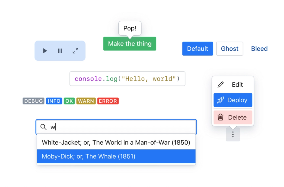
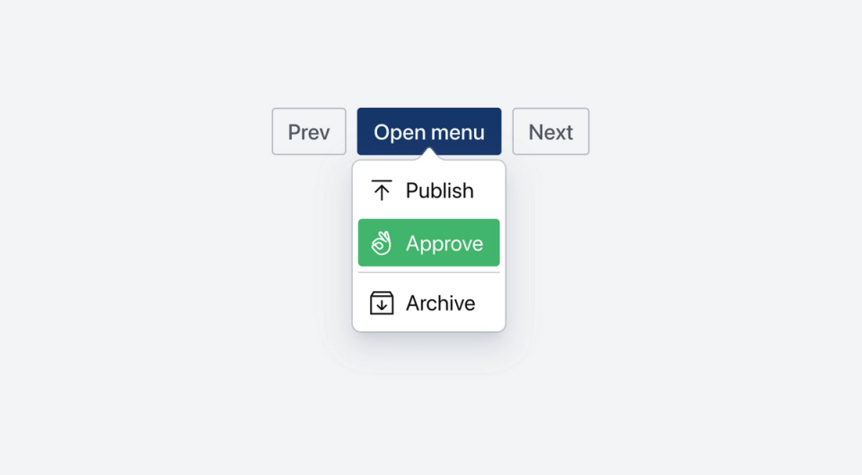
Sanity UI is structured and composable
Like with content, the more you think through how your system is structured, the more flexible it becomes. With constraints come freedom. Structured content is at the heart of Sanity, so it only makes sense that the heart of our design system should be of highly composable, structured components.
These UI primitives allow for a high level of composition. Each primitive only brings exactly the props it needs to function and do its job. When you combine them, you can find unexpected and powerful patterns.
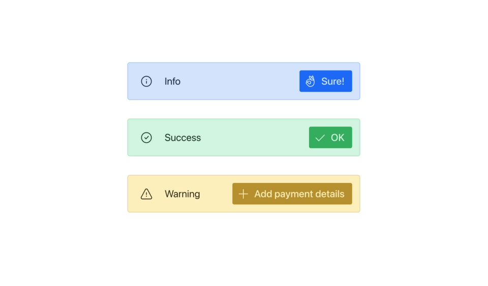
Sanity UI is accessibility-focused
In our research, it felt like many design systems were focused on making things look their best and then focusing on accessibility. For Sanity UI, we wanted to make sure we treated accessibility as a key feature and constraint for our designs. From default color schemes to carefully designed focus rings and states, accessibility is baked in.
Not every interaction comes with browser-defined accessibility. For interactive components, like dialogs, buttons, and autocomplete, we worked directly from the WAI-ARIA guidelines and patterns and tested each one using screen readers.
Sanity UI is themeable
Creating custom interfaces makes Sanity Studio powerful for teams to define out new workflows or ways of managing data. Borrowing from the JavaScript approach to content modeling in the Studio, the theming Sanity UI will work the same way. The interface is completely defined in JavaScript, including theming and CSS.
A common language
Design and development teams can often feel like they’re speaking different languages. When language differs, miscommunication can often be the outcome. At Sanity, we believe the best products and sites are created by the intersection of disciplines.
Sanity UI is built by both designers-who-code, as well as engineers that take great pride in a solid user experience. The UI primitives, components, and properties have all been named extremely carefully. The goal is to create a system where components are named to evoke terms designers understand at use, while giving logical aspects that are familiar to developers.
With a common language, common components, and a common goal, we think all things are possible.
Get started with early access
Sanity UI is a work in progress, but is already making feature development easier at Sanity. Our new team and project dashboard was written using it, and the entire Sanity Studio is currently being rewritten to take full advantage of Sanity UI. With all the benefits, we don't want to keep it to ourselves.
Starting today, we're providing early access. We've built a full documentation site, complete with interactive code playground, reference docs, and guides for getting started. We're also building new pattens and integrations to make amazing things possible inside and outside of Sanity Studio. We'd love to get any and all feedback. Join the Slack community and post in our #beta channel if you need help or want to provide insight into how you're using Sanity UI.
The next few months will be exciting times as we release new features around Sanity UI, including many new data bindings, components, patterns, and more.
