Say hi 👋 to the new delightful Sanity Studio (ssr)
Written by Even Westvang
Missing Image!
It’s been one year since we launched Sanity publicly. We have since been busy continuously developing and improving – from backend improvements like arithmetics in GROQ to new functionality in Sanity Studio, such as Structure Builder that gives developers unparalleled flexibility in how content may be organized in a CMS. In the process, we were sometimes forced to cut corners – amongst the corners cut, visual finesse. Now was the time to fix that.
We’re very excited to release a complete Studio design revision. We have been careful not to break existing workflows while laying a better foundation for what’s to come. This new Studio is made to adapt when new features come along and to better accommodate upcoming plugins, tools, and extensions. It still built in React, it still has a real-time user interface, and it’s still open source and still deploys as a static bundle that can be hosted anywhere that can serve up a file. With this release, we feel pretty confident that we ship the world’s best content management system for both developers and content editors alike.
npm i -g @sanity/cli && sanity upgradeOnboarding our new designer
We feel super privileged to have had Marius Lundgård join our team as a product designer. Doing a visual overhaul proved a good way to onboard him. Marius joined us after working as a product/editorial designer in the Norwegian Broadcasting Corporation (NRK), where he designed long read documentary experiences in React, and worked on one of Norway’s most popular apps: the weather app Yr. He has studied graphic design at the Rietveld and worked in the US and the Netherlands, and have previously worked with our friends at NODE Oslo/Berlin. He currently resides in Oslo with his girlfriend Anna.

Improved user experience
Developer experience (DX) is the lifeblood of Sanity. We have put a lot of thinking into how we can make a product that’s delightful for developers to use – whoever they are. That’s why you configure it in simple JavaScript, hitting the midline between convenience and customization. It makes it possible to version control a content model, to easily include multiple studios in a CI workflow, or to just make a fast throwaway CMS for a weekend project.
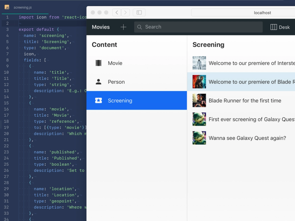
User experience (UX) is of course on a broader continuum, and this release has been highly motivated to better meet the goals of authors and editors. We want to make it really easy for people to build a content management and editing – experiences that feel productive, welcoming, and… delightful.
A CMS that can be used on all screen sizes
Content Management Systems are almost all exclusively built for desktops. But we find ourselves so often editing content in Sanity on mobile, that we wanted to not just accommodate for that setting, but make sure that you can use Sanity on handheld devices.
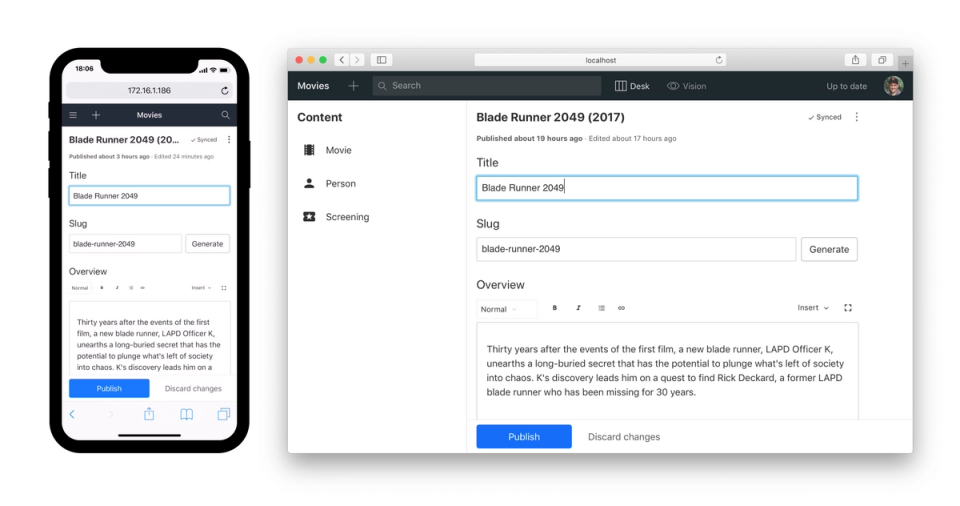
The Publish button has been moved to the bottom of the screen, and it’s now the only primary button on the screen.
Global navigation that scales
We have moved the global navigation from the left sidebar and merged it together with search along the top of the screen. This is a common pattern, and we wanted to simplify things by only using one axis.
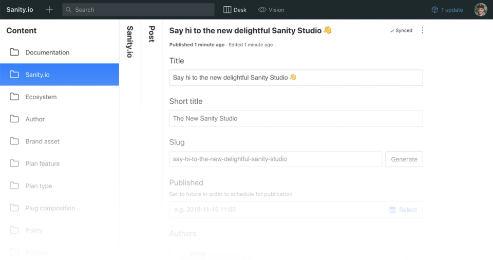
The new navigation bar packs both tools and search into one. It takes less screen real estate and is highly responsive. On small screen tools, and other affordances can be easily accessed in a side drawer, except what we have identified as the top tasks: document creation and search.
Less code, more performance
We always have a goal of making the Studio run smoother and snappier. It should be able to host millions of documents while being real-time, so there’s little room for leaks and hacks. That’s why we’re satisfied with also have removed a lot of code in this release.
Content management for everyone
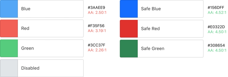
We want the studio to be accessible and possible to use for everyone. There is still work to be done, but as a significant start, we have introduced a new color palette as the default theme, following at least to the AA WCAG specifications for contrast. You will notice there’s a new color for selected items, and for the filled buttons. Even higher contrasts can easily be achieved through by overriding the default colors. We have made improvements for keyboard users (more to come).
The devil is in the details
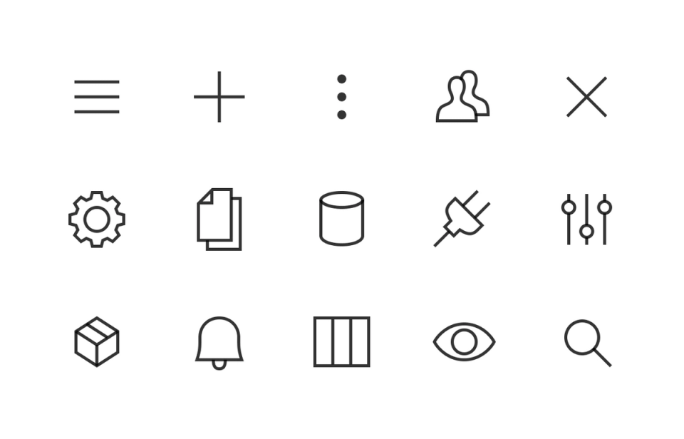
We have fixed a heap of minor visual inconsistencies and bugs. We now use system fonts, have started to create our own icon set, and have started to create a tight, visually cohesive design system. We have removed the default Sanity logo (you should add your own with sanity init plugin, choose Studio logo). Those of you who are extra curious can explore the commits on GitHub since Sanity Studio is open source.
A new exciting year lies ahead
It’s been a fun and interesting year for Sanity. We are endlessly thankful for all of you who have decided to try us out, answered our emails and questions, been hanging around in our Slack community, met us on conferences, and been recommending us to friends, colleagues, and on social media. We can’t wait to share even more powerful features, exciting use cases, and delightful upgrades with you!
