Community Digest #6: Voice assistants, studio customization, and tabs for everyone (ssr)
Written by Knut Melvær
Missing Image!
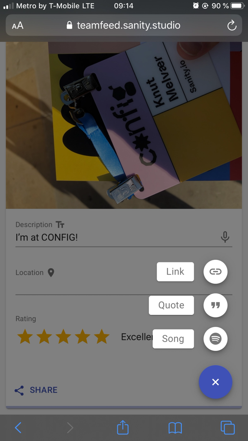
I’m just back from Figma’s conference CONFIG where central themes were community and collaboration. Make sure to check out the videos when they are out, a lot of inspiring and educational talks. And relatable!
We’re trying to make it possible for you to customize and use Sanity to make it easier to collaborate without having to compromise between developer and authoring experience.
And the interesting thing with customization: It may appear to be specific and personal, but as often, you have solved problems that others also have. That’s why we find it so powerful when you share what you have done with Sanity, from rebranding the Studio to sharing plugins, starters, and your experiences.
–Knut (dev. relations)
Community Highlights
Our meetup on rapid prototyping and voice assistants
We hosted a Sanity.io User Group San Francisco meetup. We talked about rapid prototyping with Sanity Studio. More importantly, we got Lucho Suárez (@luchoster) from RR Partners to come from Vegas to talk about how they made the city’s official Alexa skill. A super inspiring case demonstrated by a really cool person. We will come back with more from the meetup once we have the videos ready!
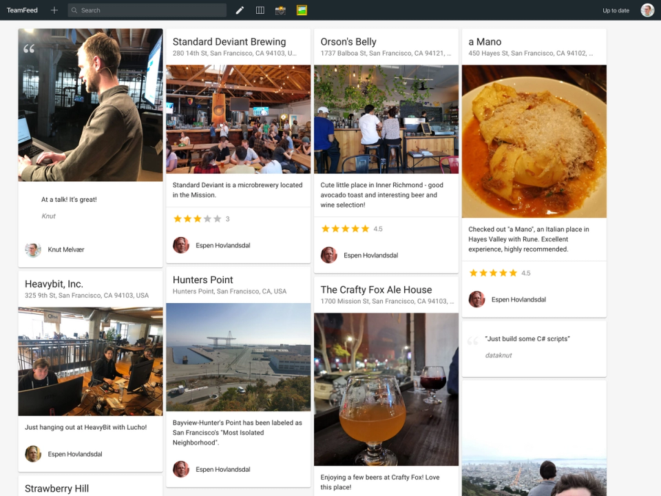
Espen and I decided to give ourselves less than a week to come up with something interesting to showcase how you can customize the studio. So we made TeamFeed™, a sort of a social feed for your team. We will release the slides, video, and code for it soon!
Rebranded Studio
Jérôme Pott (@mornir0) shared this screenshot with us in the Slack community. One of our favorite things is to see how people make the Studio their own, with logos, icons, and colors.
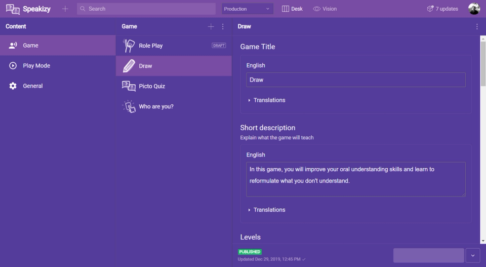
Jérôme also shared the code to do this:
 --font-family-sans-serif: 'Roboto';
--body-bg: #44337a;
--text-color: #fff;
--brand-primary: #784ba3;
--brand-secondary: #95bf6f;
--main-navigation-color: #784ba3;
--component-bg: #553c9a;
--component-border-color: #777;
--component-box-shadow: 0 1px 3px color(var(--black) a(50%));
--state-danger-color: #f8495f;
If you want to do the same exercise, you can go to this guide and follow the steps.
Portable Text & The CMS wars
Preston So (@prestonso) posted an interesting blog post on what he calls “the second CMS war” following Gartner’s descision to take out the Web Content Management Magic Quadrant. That made Ronald Aveling (@ronaldaveling) think of Portable Text, and platform agnostic formats:
That’s exactly what PT is designed for! 😀
Tabs for everyone!
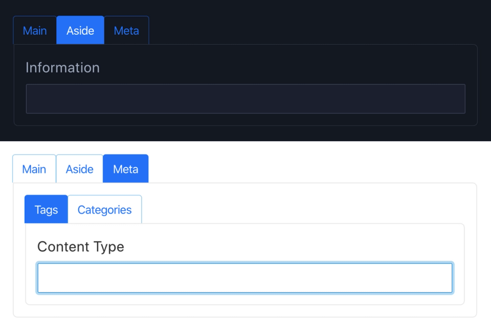
We saw some lovely collaboration between Ove Andersen and Kim Björkman in the community Slack this week. It led to a new release of the tabs plugin. It takes fieldsets, and turn them into… well, you guessed it. Tabs. It can be very useful when you have field level localization and so on. Check it out on npm.
Explorations in e-commerce and Gatsby
There are more and more projects exploring e-commerce on the JAMstack using Gatsby + Sanity.io. This week, Rich Hains (@studio_hungry) has been sharing his progress making a Gatsby site with e-commerce from our friends in @snipcart.
Previews for laywers
Michael Edelman (@edelman215) has been sharing his introduction to Sanity with us on Twitter. We can’t hide the fact that we’re pretty flattered by his response.
Built with Sanity
Hive Initiative
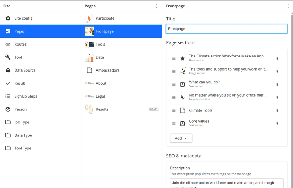
Nicolas Tonne and his team have launched the website for the climate action workforce called Hive Initiative on Next.js and Sanity.io. Nicolas writes:
“It was pretty amazing to discover that the designers and Hive-members had been continuing work on sub-pages, sections and content without any dev-help :mindblown:
We got some praise...
Thomas Strobl (@tom2strobl) left a striring message in the community slack (sign up if you haven't):
So, after working with Sanity for the last 1-2 months I gotta drop a little bit a rant from my end here. How dare you. There’s a market of tools and there’s always compromise for all sorts of reasons, scope creep, stakeholders, what not. And then you as a dev have a utopian vision of how awesome things could be if time and money and whatnot would not be an issue. And then you guys come along and even improve that vision. Like conceptionally (the backend-abstraction is cool, the de-coupled studio so perfectly executed, but also smaller things like that parts system is just downright genius), but also practically – I yet have to encounter a bug or any sort of weirdness (or lets say a lack of documentation) at all. [...]
Uneccessary to say, that made our week! (And, yeah, we'll try to live up to it the best we can. 😅)